Serve The City
Project Year: 2024
Project Type: Brand Redesign
Project Role: Creative Direction
Project Client: Cross Point Church
PROJECT OVERVIEW
Serve The City is a dedicated week mobilizing the church to love their neighbor; through practical acts, being the hands and feet of Jesus, across Middle Tennessee.
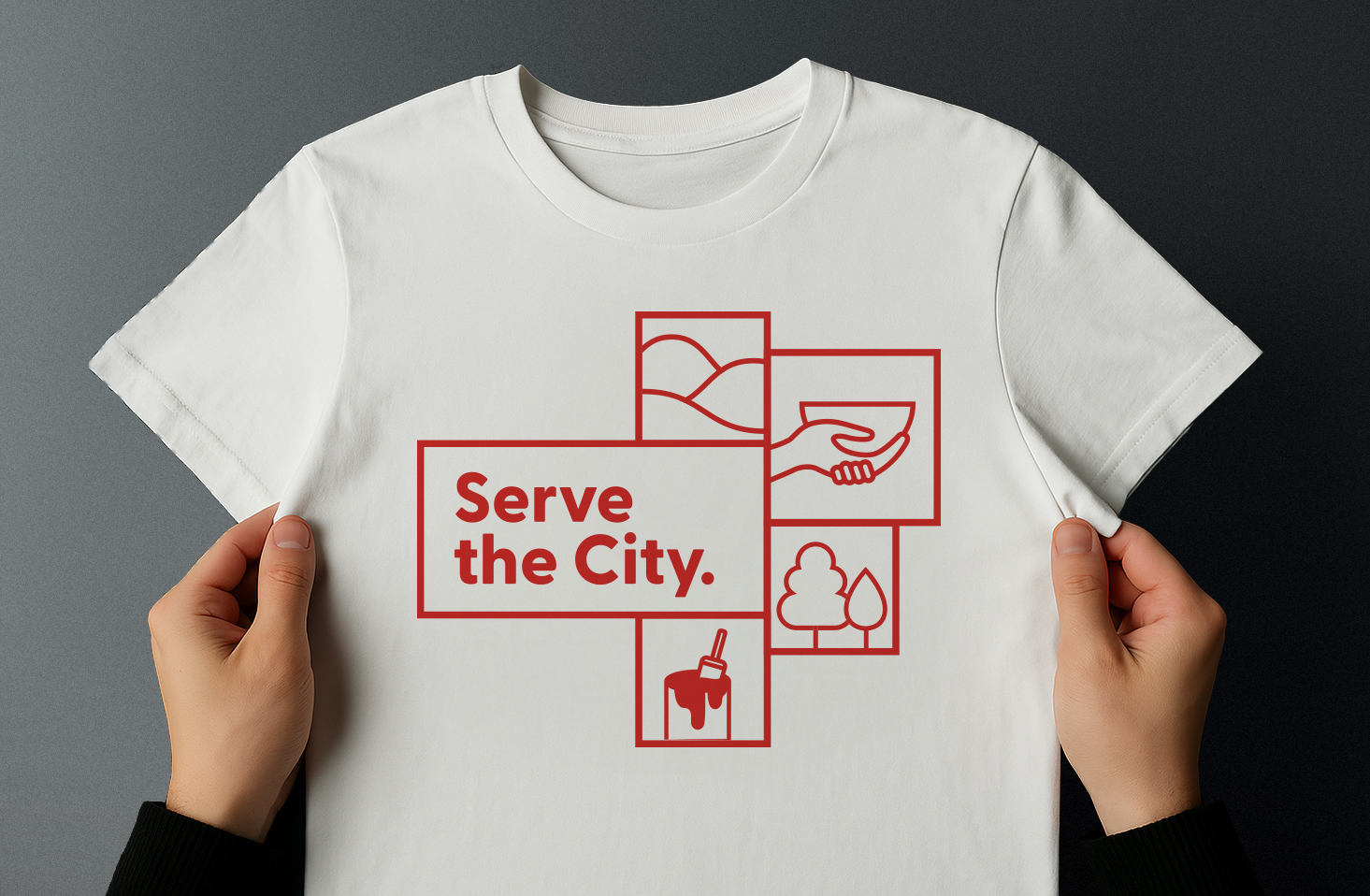
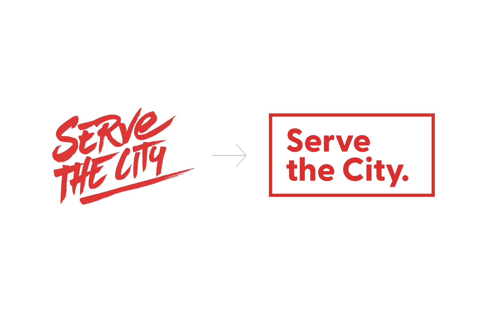
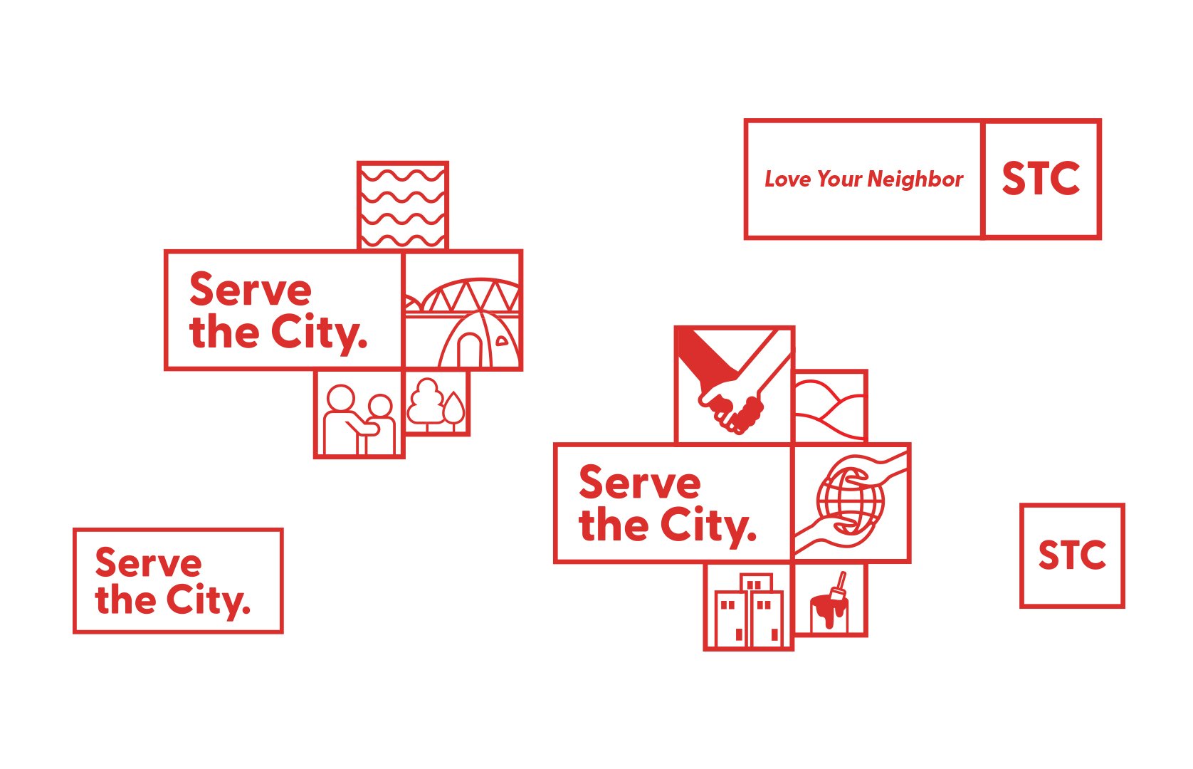
A rebrand was needed and so I helped brief and bring creative direction to the reworking of Serve the City. Through research and development we set the strategic vision and empowered the Art Director and Designer(s) to begin a new visual identity. At the core, we needed to retain the legacy of the brand, but also propel it into a new era of relevance and clarity. The Lead Designer helped modernize the brand with a clean, contemporary sans-serif typeface and a fresh suite of interlocking illustrations, designed to visually reflect the diverse ways people could engage in serving their local community. While we retained the signature red from the original identity to maintain continuity, every other element was reimagined by the Art team to feel more flexible, inviting, and aligned with our mission.
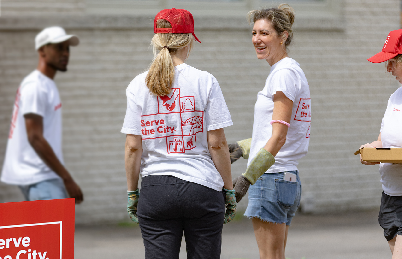
This rebrand was launched through a range of collateral; banners and t-shirts to hats, digital signage, and social media assets. The updated brand reinforced the message that faith is not just spoken, it’s lived. This rebrand helped bridge faith and action, creating a compelling and cohesive experience that empowered the church to serve with purpose and passion.
PROJECT EXAMPLES
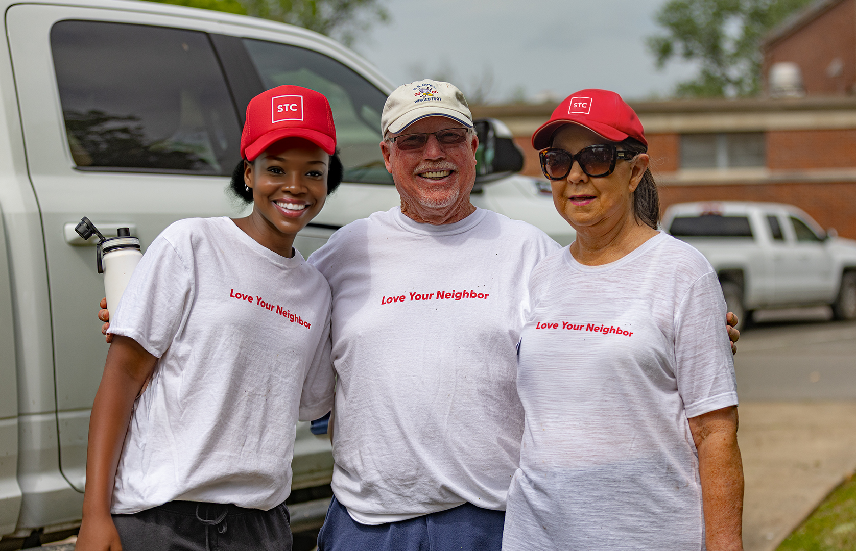
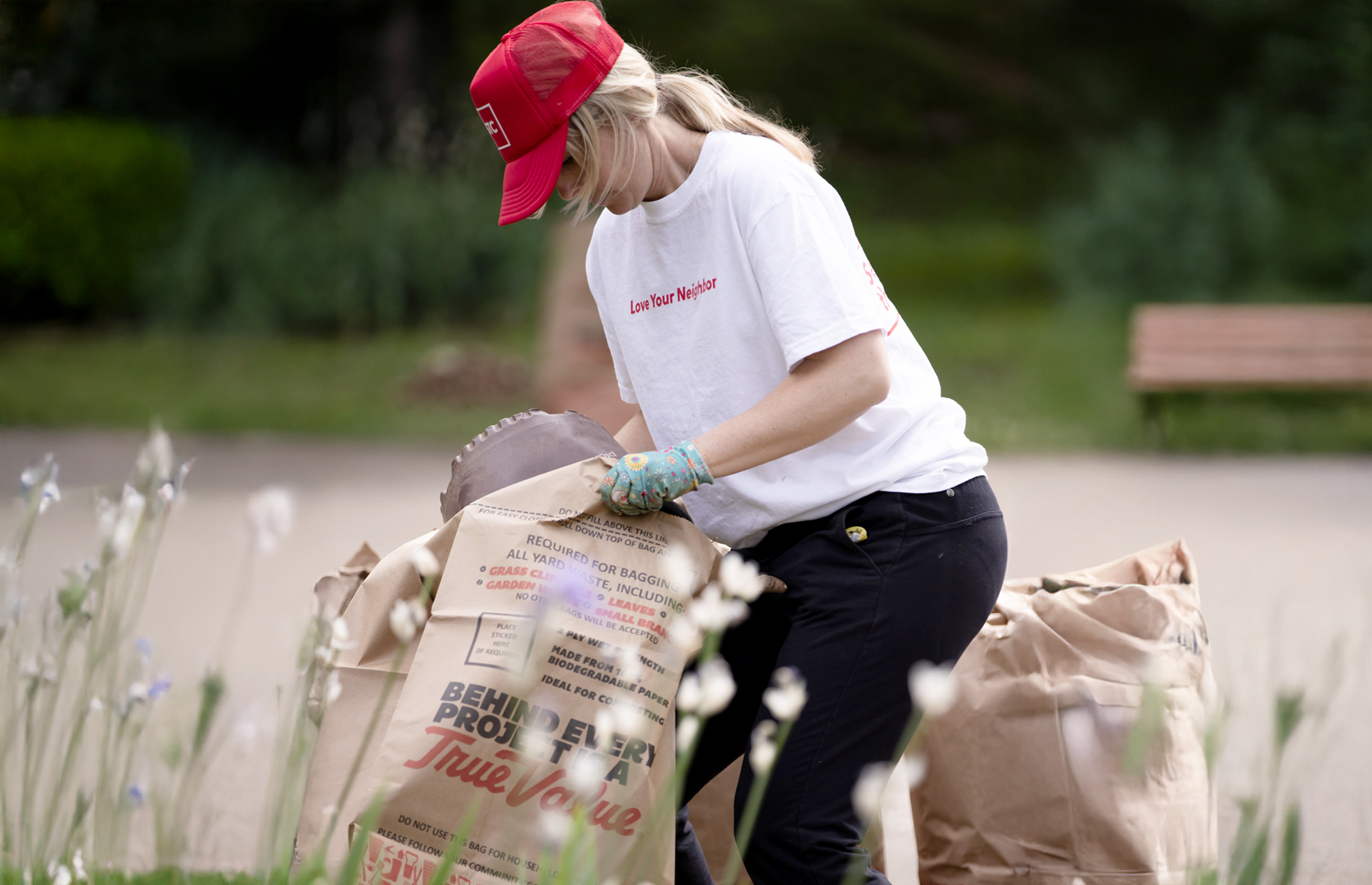
PROJECT REFLECTIONS
WHAT WENT WELL?
- Record sign-ups for the following two Serve Week events, succeeding to hit lofty goals for both events
- We struck the balance we were aiming for; honoring the legacy of Serve The City while bringing a revitalized, more dynamic identity. The red carried over seamlessly, anchoring the new brand with familiarity, while the updated type and illustrations gave us freedom to express the wide range of ways people could engage.
- The brand had legs; showing up boldly across t-shirts, hats, signage, social, and digital assets. It was incredibly rewarding to see it brought to life in such diverse and tangible ways.
- Collaborating with the internal Art Director and design team was a highlight; this was a true team effort from start to finish.
WHAT DIDN’T WORK?
- There was some lingering confusion around the dual naming; Serve The City as the legacy brand and Serve Week as the event, which created occasional inconsistency in language across platforms.
- We also moved fast, which meant some opportunities for deeper storytelling got left behind in the push to launch collateral.
1% BETTER:
- A phased brand shift might have helped reduce confusion between the brand and the event.
- The illustrative system worked well, but adding motion or animation could’ve elevated further.
PROJECT IN MIND?
Let’s make it happen together!
Whether you need hands-on creative direction, strategic leadership or data-driven execution, I bring the expertise to move the mission forward. Click below to connect and we can start building something extraordinary today.
